For the first 2 posts documenting how I made this dinosaurs silkscreen
click here for part 1
and click here for part 2
Now that I have my transparancies I can create the stencils I will use to do the actual silkscreening, the printmaking. I start with a blank silkscreen. Screens these days are not made with actual silk any more, they are made with a polyester fabric stretched over a metal frame, the yellow material you see in this photo. This mesh is very fine, but the holes are big enough to allow ink to pass through the fabric. But this porous fabric is where silkscreening gets it's name.

I coat my screens with a light sensitive thick purplish liquid called emulsion. This is messy and gets on my clothes, especially the bottom of my socks a lot. Then I leave trails of purple footprints around my studio. Here is what a screen looks like right after I coat it, you can see it's still wet.

Because this emulsion is light sensitive I keep my screens in a dark closet until they dry.
Once the emulsion is completely dry I can expose my screen. I had to expose 6 screens, one of each color of the print. Here I am showing 2 screens as I prepped to expose them.


I put the transparancy I printed onto the screen face down, then place a sheet of glass on top of that to press it down flat on the screen.
In the top image you can see the halogen lamp I use to expose my screens. It's like exposing photographs in a dark room, although these are not so light sensitive that I need it to be totally dark, but shining a bright, strong light on them for 15 minutes creates a chemical reaction in the emulsion turning it a sort of salmon color.
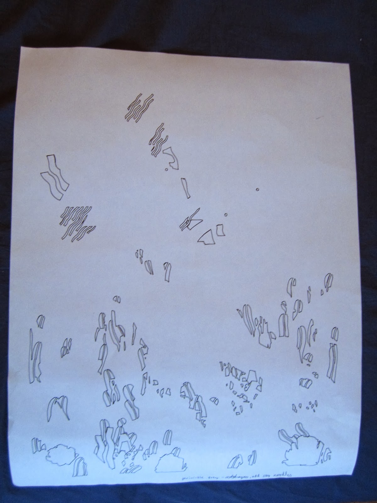
The light passes through the transparent parts of the transparency and makes the emulsion hard and water proof. The areas under the black parts of the transparency are hidden from the light and remain soft and rinse out with water. After exposing them for 15 minutes, I rinse my screens out with strong water pressure and the areas that are black in the transparencies wash away leaving a very crisp stencil.
This is what the top screen looked like when I washed it out.

You can see 2 stencils on here, the top strip is actually a color for a different smaller print, and the lower area is the champagne color for the dinosaur print. The champagne colored ink will pass through the yellow areas on the screen, these are the areas where the emulsion washed away leaving just the mesh of the polyester fabric. The salmon areas are where the emulsion hardened and did not wash away. The emulsion will keep ink from passing through the purple parts of the screen onto the paper.
I now have 6 of these screens, each with a different color stencil on it.
Now I am ready to start printing!
Here is my work station.

Here I am printing the first color. This is the sky fade. Below you can see that the ink on my screen blends from a yellow on the left to a red on the right. I place a big sheet of paper under the screen. Then I use the squeegee you see leaning along the top edge of my screen to pull the ink across the screen. This pushed the ink through the stencil onto the paper underneath it. I can do this hundreds of times if I wanted to, but usually I just print between 30 and 50 prints at a time.
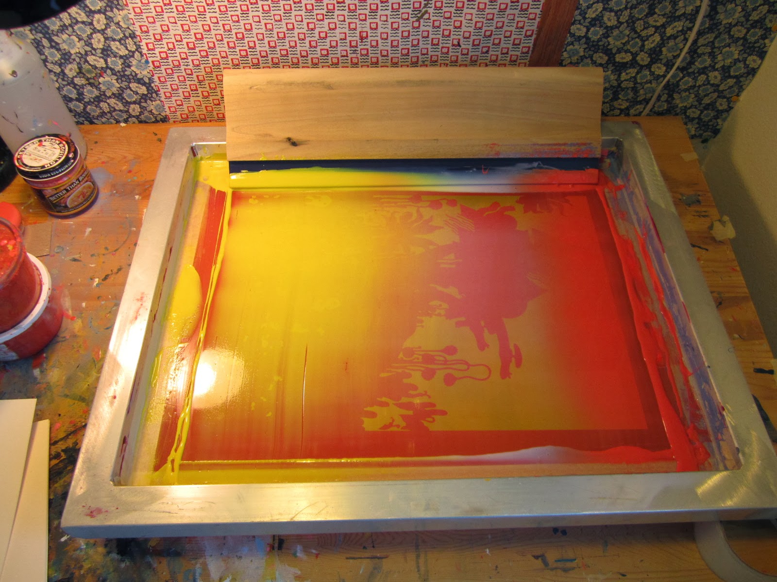
Below you can see what the print looks like with just the first layer of color on it. The fade gives it the appearance of having 2 colors.

I forgot to photograph the 2nd color of ink (a shade of blue) on the paper. so let's skip to the third color.
Below you can see the 3rd color of ink on my 3rd screen. Here I tried using both a golden yellow color and then the grass green you see in the photo below. Silkscreening allows for some experimentation. Ink colors can be changed in the middle of printing.

Below you can see what the print looks like after printing the 2nd and third colors. The second color
is that blueish grey color, and third is the darker mustard yellow/ green.

Below you can see what the print looked like after I added the 4th color, the champagne colored layer that included the chair wood, the palm leaves and the dinosaur scales.

You can see 2 color variations so far below. These both have the first 4 color layers on them, but they have different sky colors.

Here is what the print looked like after the 5th color was added. This layer is a bit harder to see because it is mostly a layer which overlaps with the blue color that was already printed. In the photo below it is a transparent light turquoise color. You can see the color most clearly in the fern-like plants that end in a tiny curly-q shape on top.

In the photo below you can see the 2nd color variation, in this color scheme I made the 5th color layer a lavender/ pink color. It shows up more clearly than in the photo above. Here you can also see that where it overlaps with the earlier blue layer it creates a deeper indigo or purplish blue color. Layering transparent colors creates new colors and adds to the overall richness of the finished print.

At last I printed the final layer, the black outline. here is a scan of the final piece with all 6 color layers. This is only one version, and the color scheme that I ended up liking the best. I have another 2 or 3 color variations that I didn't scan.